
Bride Journeys
Role: Product Designer + Visual Designer
THE PROBLEM
My design partner and I were tasked with introducing Journeys- collections of related articles that are packaged together in themed sections for the Brides vertical. The goal was to help the user learn about a specific topic based on what article they landed (usually through search) and invite the user to diving deeper into related articles within the journey.
THE CONSTRAINTS
The most challenging part was designing key elements in a minimal way so that would not distract the user from the content of the article itself.
Design Iterations
Solutions
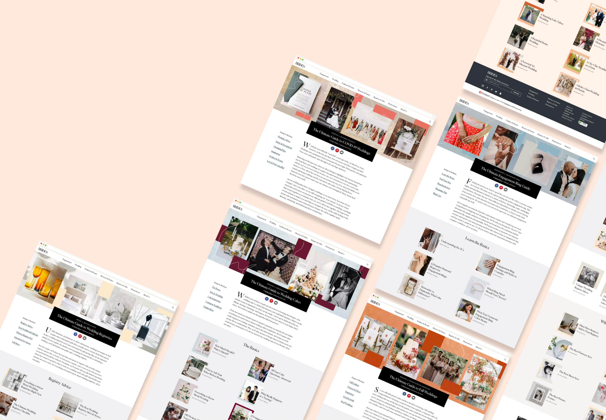
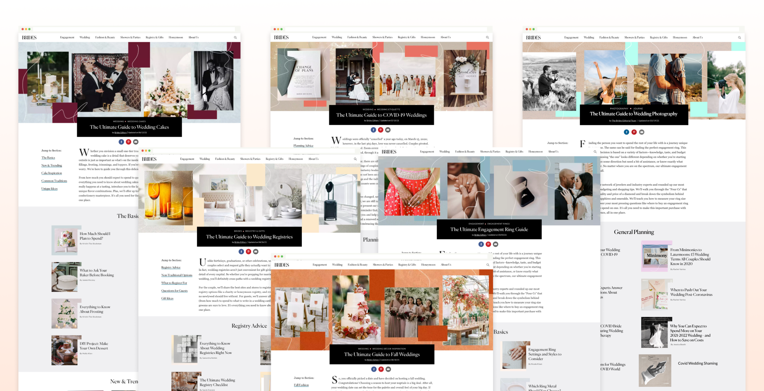
First: A root/landing page that visually demonstrated subsections of the journey.
Second: Three carefully designed visual cues that would let the user know an article was part of the Journey. The user should read an article and after being satisfied with the content and be signaled to the Journey of related pieces to learn more.
1. “GUIDE CRUMB”
The guide crumb is a Journey-specific element we added to the page to call out attention visually as well as functionally as it expands to reveal the contents of the section and places the user in the journey.

2. FEATURED LINK
We often use featured links within articles to call attention to an external link. This featured link was styled to associate the document with the journey it is in as the reader makes their way down the page.
3. BOTTOM OF PAGE CAROUSEL
The Bottom of Page Carousel was named after the solution that easily worked on mobile, however desktop was more challenging. We resolved to using a more robust module that would allow the user to browse the entire journey in this condensed space at the end of the document and have the ability to jump sections.
Graphic Treatments
The team found that the recirc images needed something to show that they were a part of a bigger Journey. To solve this, I created a novel design system for the article recirc images. This system (1) visually indicated that the recirc images were part of a bigger journeys and (2) allowed for our visual asset designers to quickly change and apply these treatments as more Journeys were needed.

The Result
This journey design was applied across 10+ new Journeys (and counting)! Engagement across featured articles is up and our Journey elements and structure are being adopted by other verticals within the company.