
Brides Calculator
General Assembly Course Project
Role: UX Researcher + Product Designer
THE PROBLEM
For my General Assembly project I decided to work on a project on my team’s next year’s roadmap. The problem space was the following: Today’s Brides/Grooms need a flexible and educational budgeting tool so that they don’t feel so lost and overwhelmed when starting the planning process, and so they can make informed, realistic budgets.
THE CONSTRAINTS
A major business need was to drive more traffic to our articles though the calculator experience. Second, we wanted to highlight our editorial data within the calculator functionality. And third, the calculator would have to be accessed in a non-logged in state.
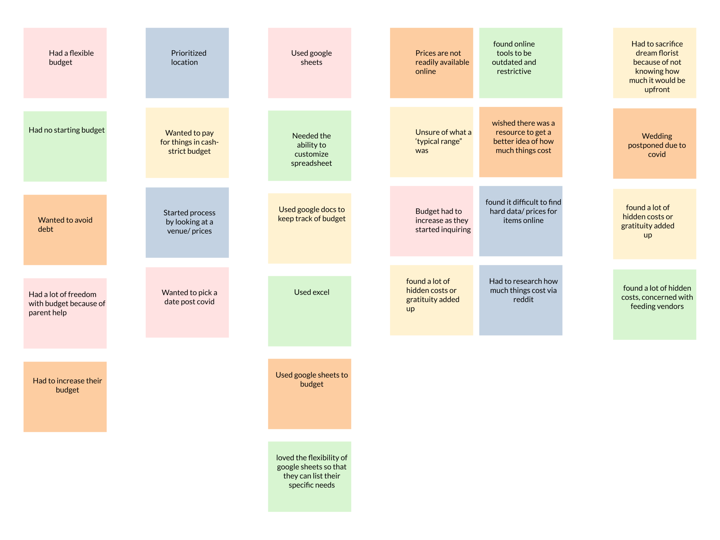
User Interviews Insights
Majority of users felt lost and uninformed about initial pricing.
“We eventually just used Google Docs to track everything.”
Users budgets and priorities were all very different but their frustrations about lack of information online was similar.
“I was surprised at how outdated everything seemed.”
“I wish there were tips for saving money.”
Affinity Mapping
Feature Prioritization
Have basic addition/subtraction functionality of running tab of costs.
Graph or visual representation of total budget breakdown.
Suggest articles/ resources that can provide advice.
Suggest average price of certain common wedding costs.

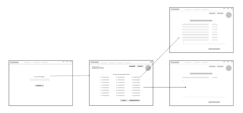
User Flow

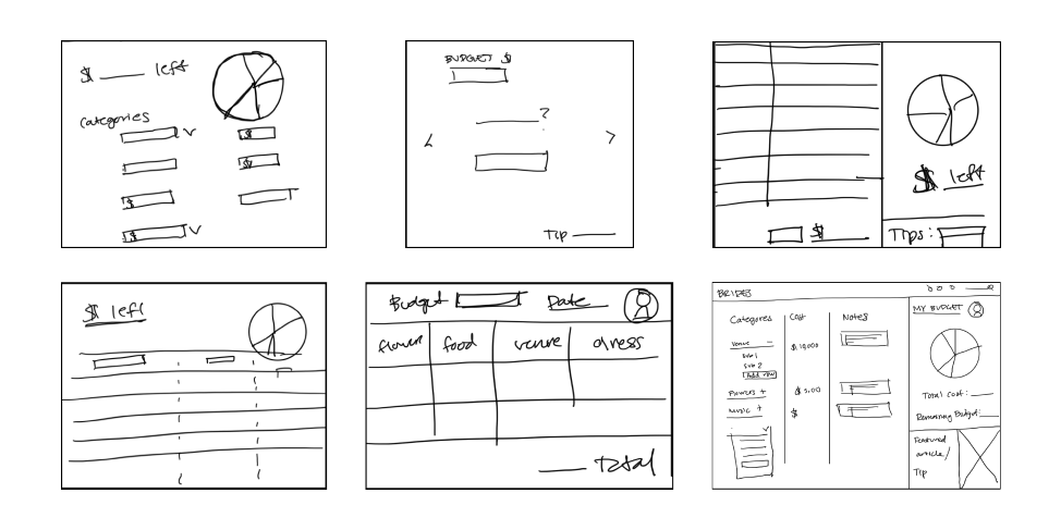
Solution Sketches and Design Explorations
V1 Prototype- Results from moderated testing
Remove parts that have no functionality.
Simplify process of creating a custom budget list.
Clarify symbol usage and make more universal.

Defining a Design System


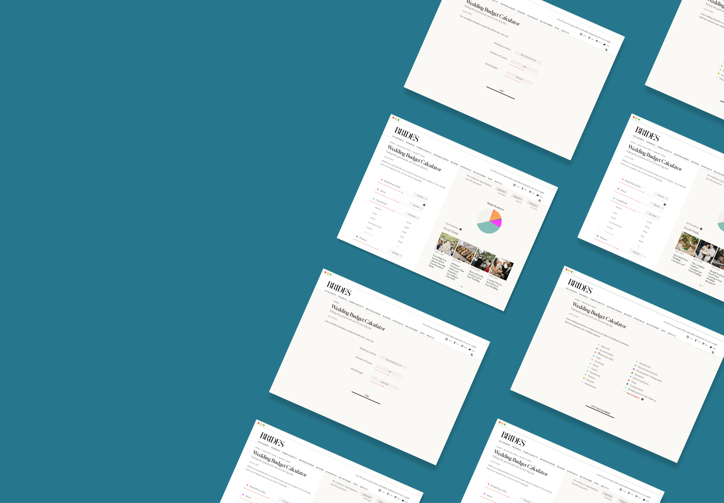
THE RESULT
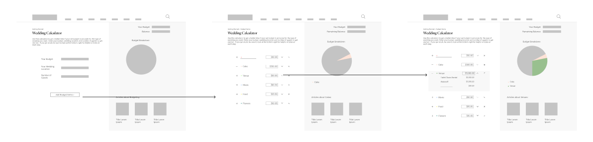
Based on the moderated testing of V1, I applied the following changes to V2:
Took out design elements that had no function and added a slider in addition to the input field.
Simplified the onboarding process so that the user focuses on adding their budget items first before worrying about numbers.
Streamlined the spreadsheet page so that the user only saw the categories they selected on the screen.
Made it clearer how expand the accordion to add subcategories and took out the additional icons used.

NEXT STEPS
Continuing to do moderated testing and unmoderated testing.
Start to ideate a mobile/responsive solution.
Leverage internal company tools to perform broader unmoderated testing.